Skip to:
TAB Image
This component is used to display all body images on the site.
It has a set of styles and renditions that are working in pairs in order to optimize the renditions according to the dimensions images will be displayed in.
| Style | Rendition |
|---|---|
| Square body image | Regular Square image |
| Rectngle body image | Rectangle body image |
| Small icon | Small icon |
| Large icon | Large icon |
| XL icon | XL icon |
| XL icon desktop mobile | XL icon desktop mobile |
If an image is cropped when activating the style and rendition, you can select :Override global configuration" in the "Rendition" tab and select "Adjust image height or width" according to your needs.
You also have a set of styles that will allow you to manage the spacings around the image.
- For hero banners, use Teaser component
- All images must be uploaded to TAB in a TIF format.
- Use jpeg/jpg as standard in AEM and PNG only if it has transparent background
- Please see below different image renditions that are set for this site.
Some examples below.
Rectangular body image

Renditions
| Breakpoint | Width | Height |
| 320 | 500 | 375 |
| 415 | 767 | 575 |
| 768 | 580 | 435 |
Square body image
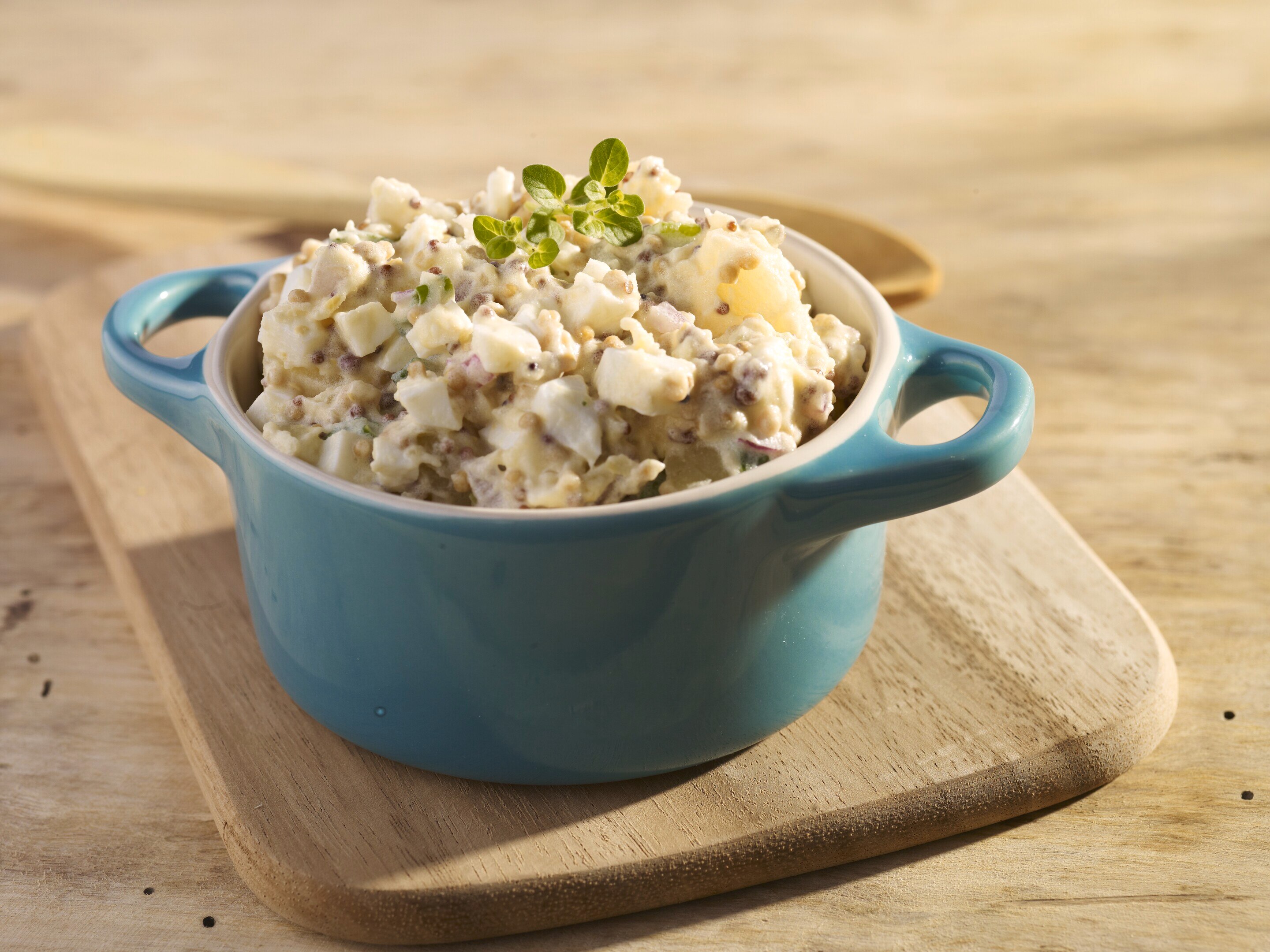
Renditions
| Breakpoint | Width | Height |
| 320 | 767 | 767 |
| 768 | 991 | 991 |
| 992 | 600 | 600 |
Some examples for transparent images (use png)
